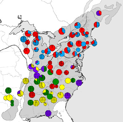
Example output from the viewer. The genetic composition of each population is reflected in pie charts showing the proportion of each haplotype present.
It was funded! Visit the latest release from the PhyloGeoViz homepage. Follow the project’s development on the project wiki and project blog.
Example output from the viewer. The genetic composition of each population is reflected in pie charts showing the proportion of each haplotype present.
Phylogeography has enjoyed an explosion of data from research on migration patterns of organisms to studies of population genetics and population structure. However, there is still no easy way to generate maps of DNA haplotype frequency data. Imagine a map with all sample locations marked, and centered on each location a pie (or stacked bar) chart is visible showing the frequency of each haplotype within the population. The size of each pie is proportional to the amount of samples genotyped in that population. Often these maps are drawn by hand in Adobe Illustrator or other difficult to use, proprietary map drawing programs (e.g. ArcGIS). In addition, this procedure becomes unfeasible with larger data sets. This method does not lend itself to viewing and analyzing multiple data sets simultaneously as is becoming more common in comparative phylogeography. I propose to develop a software package that implements such a viewer. This program would have broader applications than just to genetic data, any sort of frequency based information with a geographical component (e.g. % of sunny, rainy, snowy days) could be visualized.
The product would be a web based application with ties to Google Maps or Google Earth. The web application would include a data manager that would export KML. The KML would be used within the browser for visualization using Google Maps or could be exported to integrate with Google Earth. I envision three main components to develop. First, the data manager is needed to import, edit, and export data. Second, a visualization tool will generate the phylogeographic maps. Third, the visualization tool will be expanded to display multiple datasets simultaneously; for instance to compare haplotype frequency distributions of multiple loci or haplotype frequencies of multiple species. This program will allow manipulation of data within the application (e.g. grouping all rare haplotypes together, or only showing a subset of the populations) to generate new phylogeographic maps without need for creating and loading new input files. The goal for the program is to allow for easy visualization of phylogeographic data on a map and to facilitate subsequent spatial data analysis.
This software could be extended to calculate population structure parameters, such as Fst, Da, and isolation by distance. It could also be developed to compute more sophisticated spatial statistics or perform tests of congruence among datasets. I realize that developing a data viewer and data analyzer may be too ambitious for a summer project, so I restrict the following discussion to just development of the viewer. However, if there’s time, there are many additional analysis packages that could be developed.
There are two major strategies in how to render the pie charts themselves. One is to create a bitmap of a pie chart and associate that image with a GPS coordinate. Then in Google Earth the image is handled as a ground overlay. The ALelle FREquency Database (ALFRED) has exported pie charts in this fashion. While simple, this inelegant approach could create problems in efficiency when dynamically generating new maps when changing haplotype groupings.
A second possibility is to create pie charts out of polygons in KML (like from fmepedia). This approach is more promising because it creates better looking pie charts and could be generated within the KML framework (no need to generate an image, then import it into the viewer separately). An approach similar to this is to use SVG to generate pie chart graphics.
Once there are more than 10 haplotypes it becomes difficult to distinguish between them. For instance, if your dataset has 80 haplotypes shared among populations there are no 80 easily distinguishable colors or patterns to identify each one uniquely. Plus, the rare types will be harder to identify because their wedges are so much smaller. I see several potential ways to address this problem. First, haplotypes can be grouped and color coded respectively. These groups could be based on geographic location, frequency, genetic relatedness, or whatever the user defines. At best, the program would allow users to determine these groups dynamically. Second, users should have the option of displaying only a subset of the haplotypes. Perhaps the important information is in the overall geographic range of each type, not necessarily in specific changes in frequency.
When populations are geographically close together, the pie charts may overlap and obscure each other’s information. This can be a major problem. A simple solution is to allow the user to zoom in and minimize the pies (e.g. as implemented in ALFRED). However, this solution is not globally useful, because oftentimes the important patterns emerge at the larger scales where this method is ineffective. Alternatively, the neighboring pie charts will need to be shifted to make room for one another. This could involve placing a placemark at the location then connecting a path from there to the pie. This rearrangement could be done automatically by the program (where it iteratively moves pies out of the way, research into an efficient algorithm would be necessary) or manually by the user (requiring the pies to be dynamically ‘movable’).
Pie charts are often disparaged by information visualization gurus (see Edward Tufte) because it’s difficult to assess the relative sizes of slices of the pie. I offer this rebuttal: In phylogeographic analysis the arguments rarely hinge on the relative frequencies but rather on the presence/absence of haplotypes across the landscape, so being able to finely differentiate between wedge sizes may not be crucial. Also, the center of pie charts (and thus the location of the population) is easy to identify. However, I can see that bar graphs often are as effective, maybe more so in this context of displaying multiple sources of data at a time. Therefore, I do not intend to enforce pie charts on the masses, the application could be developed to output stacked bar charts as an alternative.
I would investigate two strategies to multi-dataset visualization. The easiest would be to generate maps in multiple windows. However, this would not allow for efficient comparison of multiple datasets. The alternative would be to present the information side by side. In this case, stacked bar graphs would be a more efficient use of space than pie charts.
Comparative phylogeography, population genetics, and invasion biology of parasitic plants and their hosts.
I’m focused on understanding the migration patterns of forests in response to climate change. This question is interesting both historically (i.e. how did temperate forest communities assemble following the last ice age?) and contemporaneously (i.e. how will our current forest communities respond to increases in CO2 and temperature?). To understand the process of range shifts due to climate change I employ phylogeographic techniques. I’m studying a host-parasite pair and comparing their post-glacial migration patterns to understand how parasites invade and persist in host populations. Knowing how the colonization patterns of parasites are constrained by their hosts is the first step in determining how closely associated species can influence each other’s migration. These results are important to forecasting how assemblages of species (i.e. communities) respond to climate change.
What excites me about phylogeography is that multi-taxa patterns in biogeography are starting to emerge. I believe that comparative studies that utilize these large, multi-taxa datasets are the next step in the field of phylogeography. To achieve this goal we’ll need better ways to visualize phylogeographic data and new analytical techniques to test for congruent patterns. In my own work, creating these visualizations have been rewarding yet very time consuming because of the lack of appropriate tools. This is why I’m proposing this project of an enhanced viewer for phylogeographic data.
Another motivation of mine for pursuing this project is to get experience in open source programming and contributing to the larger community of computational biology. My experience with programming thus far has been largely limited to personal projects; I would like to branch out and contribute more broadly by developing new analytical techniques in statistical phylogeography. I’m also interested in information visualization in general. I like experimenting with figures and different ways of representing data to make interpretation more approachable.
I know the basics of C++, R, and MatLab programming. As an undergraduate I took two introductory courses in computer science that utilized C++ in the curriculum. I then served as a TA for the Data Structures course where I led recitations, graded programming homework and exams, and helped develop interactive laboratory exams. In graduate school, I’ve taken five courses in statistics, simulations, and modeling which used C++, R, MatLab, and BioPerl. In my research, I’ve written several small programs for personal use (usually in C++ or R) ranging from simple text manipulation or parameter calculation to simulations or modeling of specific problems.
While I am not a practiced computer programmer, I feel I know the basic principles of programming. And I feel confident that I can pick up the basics of a new language fairly easily. What I have little experience in is application development and collaborative software development, but I’m eager to gain this experience and contribute tools to the greater evolutionary biology community.
I contributed to developing some interactive laboratory exams for the second semester freshman computer science course, Data Structures, at the University of Colorado at Boulder. I’ve also served as webmaster for the Women in Science and Engineering group at Duke University.